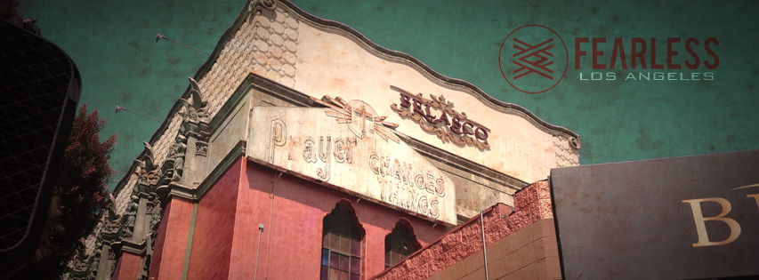
When Grace Chapel was looking to work on branding, I went about creating a new logo for them. I created a new simple icon, which replaced a dated clip-art logo they had been using. I also updated their existing font logo to match the new icon. The new monotone style allows for the color to be changed to match the particular product it's being printed on.
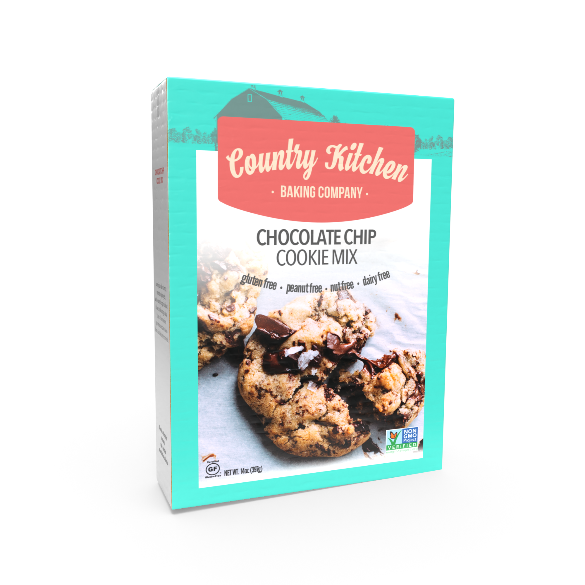
Here is a sample product design for a box of cookie mix. When competing for shelf space, you want your product to stand out. The soft, bright colors and delicious looking cookies are an invitation for a closer look.
Final render was done with Adobe Dimension.
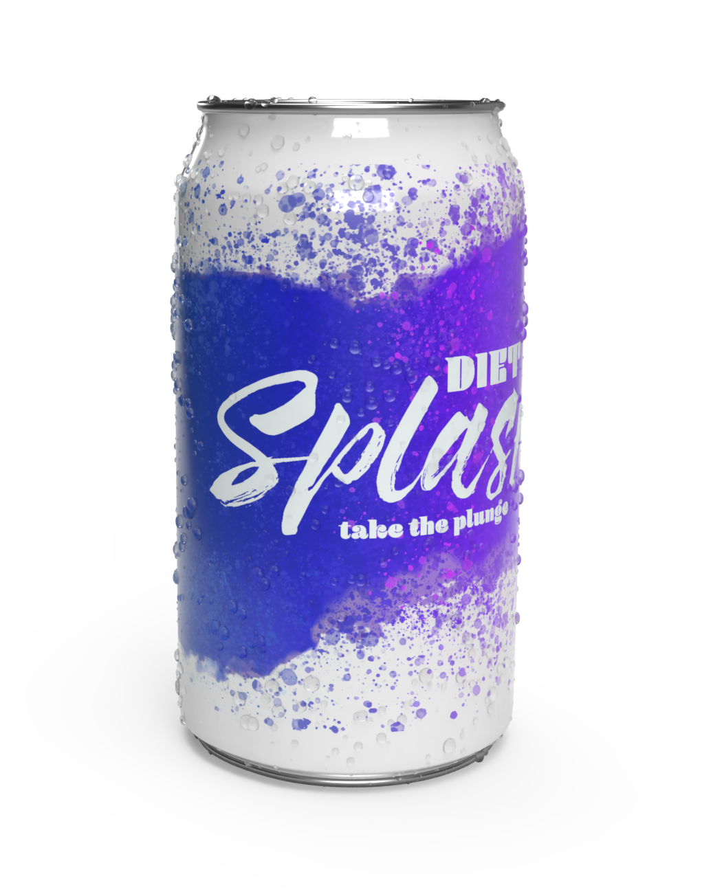
Here is a sample product for a mock soda company called Splash. Sometimes the best approach is something bold that stands out. From the in your face design, I imagine that "Splash" has an intense flavor.
Final render done in Adobe Dimension.
It can be surprising how small touches can make an impact. There are graphics all around us that we may not even notice. This is an example of the simple graphic background I created for an office of the NYS Senate to be put on multiple computers for public access.
Please feel free to check out more samples

